
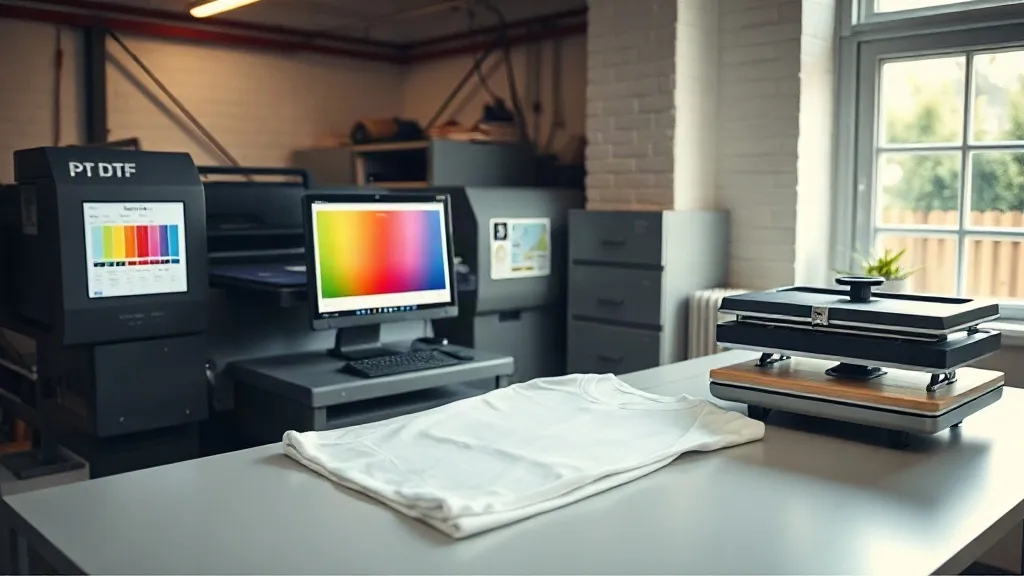
You spend twenty minutes dialing in a logo on screen, send it to the printer, press it onto a shirt, and the blue that looked crisp on your monitor comes out muddy and slightly purple. If that scenario sounds familiar, you are not alone. Color drift is one of the most persistent frustrations in dtf transfers, and it rarely gets the attention it deserves because most troubleshooting guides focus on peeling, cracking, and powder issues. Yet color accuracy is what separates a shop that clients trust with brand work from one that only handles one-off jobs.
The good news is that color management in dtf printing is not mysterious. It is a chain of variables you can measure, adjust, and repeat. This guide walks through that chain from monitor to finished garment, with practical steps you can apply this week.
Why DTF Color Drift Happens
Inkjet printing on film is only one part of the equation. Between your design file and the finished shirt, color passes through at least five stages: your monitor, your design software, the RIP that drives the printer, the printer itself, the powder and curing step, and finally the heat press and fabric. Each stage can shift hue, saturation, or brightness.
Most shops treat the printer as the only variable. They tweak ink limits, swap profiles, and blame the machine when a print looks off. In reality, the fabric and the press often cause more drift than the printer does. A 100% cotton white tee and a 50/50 poly blend will render the same transfer differently, sometimes dramatically. Understanding that chain is the first step toward controlling it.
The Fabric Variable Most Shops Ignore
DTF transfers bond to fabric through the adhesive powder, and the fabric surface interacts with that bond. On cotton, the ink sits slightly deeper into the weave and reads a touch darker and warmer. On polyester, the ink sits higher and can look brighter but also more prone to dye migration from the garment itself. Dark garments with heavy dyes, especially reds and navies, can bleed through a transfer over time if the powder and press settings are not right.
Before you blame your printer, press the same transfer onto three different fabric types and compare. You will quickly see which shifts are fabric-driven and which are printer-driven.
Building a Color-Managed Workflow
A color-managed workflow does not require a lab. It requires consistency and a few inexpensive tools. Here is the sequence that works for small and mid-sized shops.
1. Calibrate Your Monitor
If your monitor is not calibrated, every color decision you make is guesswork. A basic hardware calibrator costs less than a single roll of film and pays for itself the first time you avoid a reprint. Calibrate monthly, and use a neutral gray background in your design software so surrounding colors do not skew your perception.
2. Use the Right ICC Profile in Your RIP
Your printer's RIP software should have a profile built for the specific ink set and film you use. Generic profiles are a starting point, not a destination. If you print on the same film and ink combination regularly, consider having a custom profile made or building one with a spectrophotometer. The difference in skin tones and brand colors is often immediately visible.
When you switch film brands, revisit the profile. Film coatings vary in how they absorb ink, and a profile tuned for one film can oversaturate or mute colors on another.
3. Standardize Your Test Print
Create a single test file that includes skin tones, neutral grays, a brand color swatch, and a gradient. Print it whenever you change film, ink, or powder. Keep physical samples labeled with the date and settings. Over a few months, you will build a reference library that tells you exactly how your system behaves.
4. Control Powder and Cure
Powder application affects color more than most operators realize. Too much powder and the print looks chalky and desaturated. Too little and the ink does not bond, which changes how light reflects off the surface and shifts perceived color. Aim for an even, thin coat and shake off excess before curing.
Curing temperature and time also matter. Under-cured powder leaves a hazy look; over-curing can yellow whites and dull brights. Follow your powder manufacturer's cure window and verify with a laser thermometer rather than trusting the display.
5. Dial In the Press
Press temperature, pressure, and time all influence how the transfer settles into fabric. Higher pressure flattens the ink into the weave, which can make colors look deeper. Lower pressure leaves more texture and can make prints look lighter. Pick a setting per fabric type and stick to it. Repress tests at the same settings so comparisons are fair.
Proofing for Clients Without Wasting Film
Clients judge color on their own screens, which are usually uncalibrated. That creates a gap between what they expect and what you can deliver. The fix is a simple proofing habit: print a small swatch on the actual garment before running the full order. Photograph it under daylight, not under shop fluorescents, and send that photo along with a note that screen colors vary.
For repeat brand clients, keep a physical swatch on file. When they reorder six months later, you can match against the saved sample rather than starting from scratch. This single habit reduces disputes and builds trust.
When to Adjust the File Instead of the Printer
Sometimes the fastest fix is in the design file, not the equipment. If a client's brand blue prints slightly purple on polyester, a small hue shift in the file can compensate without touching printer settings. Keep a log of these adjustments per fabric so you can apply them consistently.
Be careful not to overcorrect. Small shifts of two to five percent in hue or saturation are usually enough. Large corrections tend to create new problems in other areas of the design.
Finding Reliable Supplies and Local Help
If you are sourcing film, powder, or press equipment, consistency matters as much as price. Switching suppliers mid-project is one of the fastest ways to introduce color drift. When you search for dtf transfers near me, look for suppliers who publish their film specs and can answer questions about ink compatibility. A supplier who understands color management is worth more than one who simply undercuts on price.
Local print communities and trade groups are also useful. Many shops share profiles and press settings for common fabric and ink combinations, which can save you weeks of trial and error.
Frequently Asked Questions
How often should I recalibrate my monitor for DTF color work?
Monthly is a practical baseline for most shops. Recalibrate sooner if you move the monitor, change lighting in the room, or notice that prints suddenly look different from what you see on screen.
Can I use one ICC profile for all fabrics?
No. The profile controls how the printer lays down ink on film, but fabric and press settings determine the final look. Use one profile for the printer and film combination, then adjust press settings and file tweaks per fabric type.
Why do my whites look yellow after pressing?
Yellowing usually points to over-curing or excessive heat. Check your press temperature with an external thermometer, reduce dwell time slightly, and make sure the powder is fully shaken off before curing.
Is a spectrophotometer worth it for a small shop?
If you handle brand-color work or repeat orders, yes. It lets you build custom profiles and measure drift objectively. For hobby-level volume, a calibrated monitor and consistent test prints may be enough.
How do I stop dye migration on dark polyester?
Use a low-bleed film, keep press temperature within the powder's cure window rather than pushing higher, and consider a poly-specific powder. Test on scrap garments before committing to a full run.